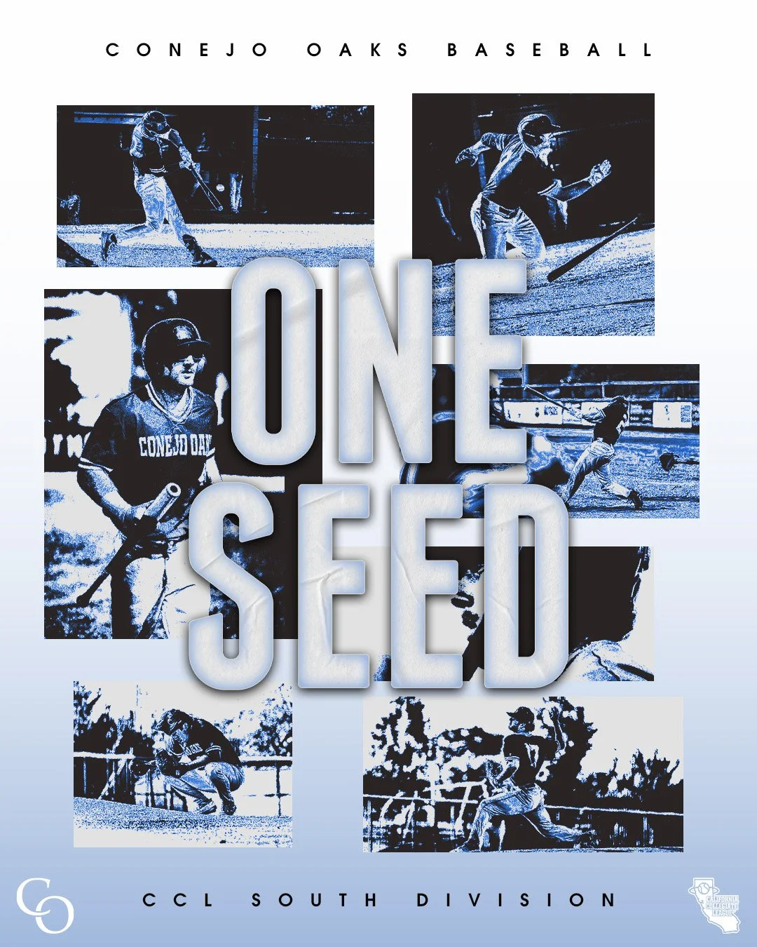
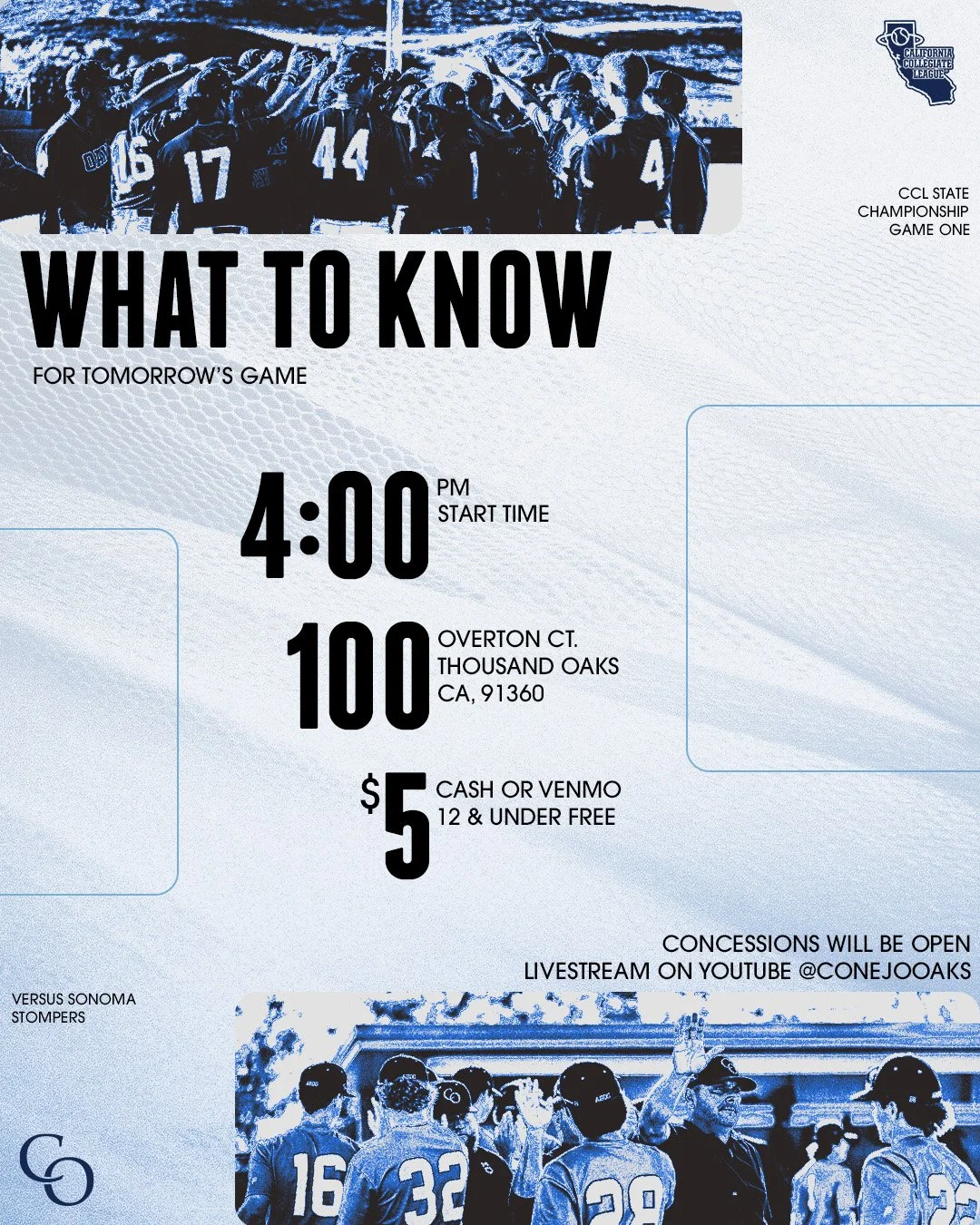
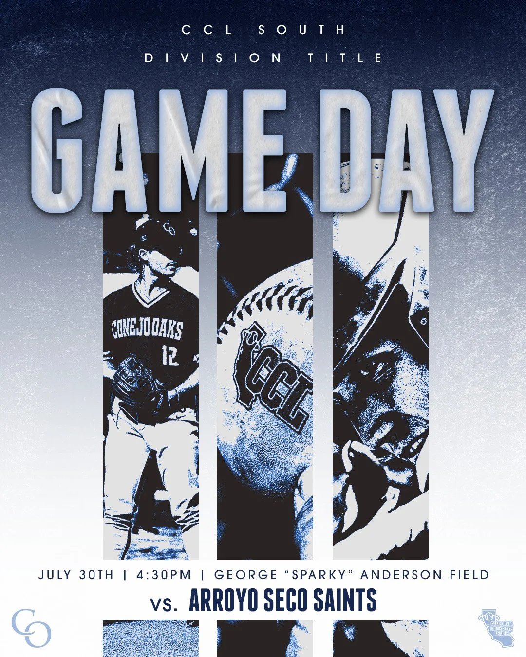
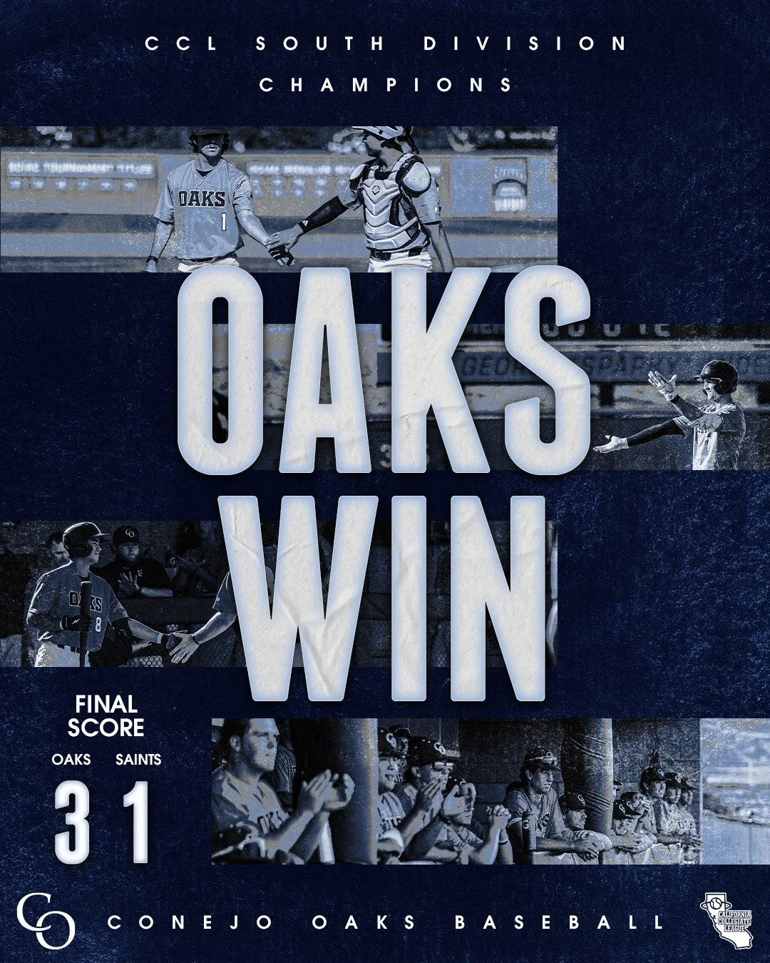
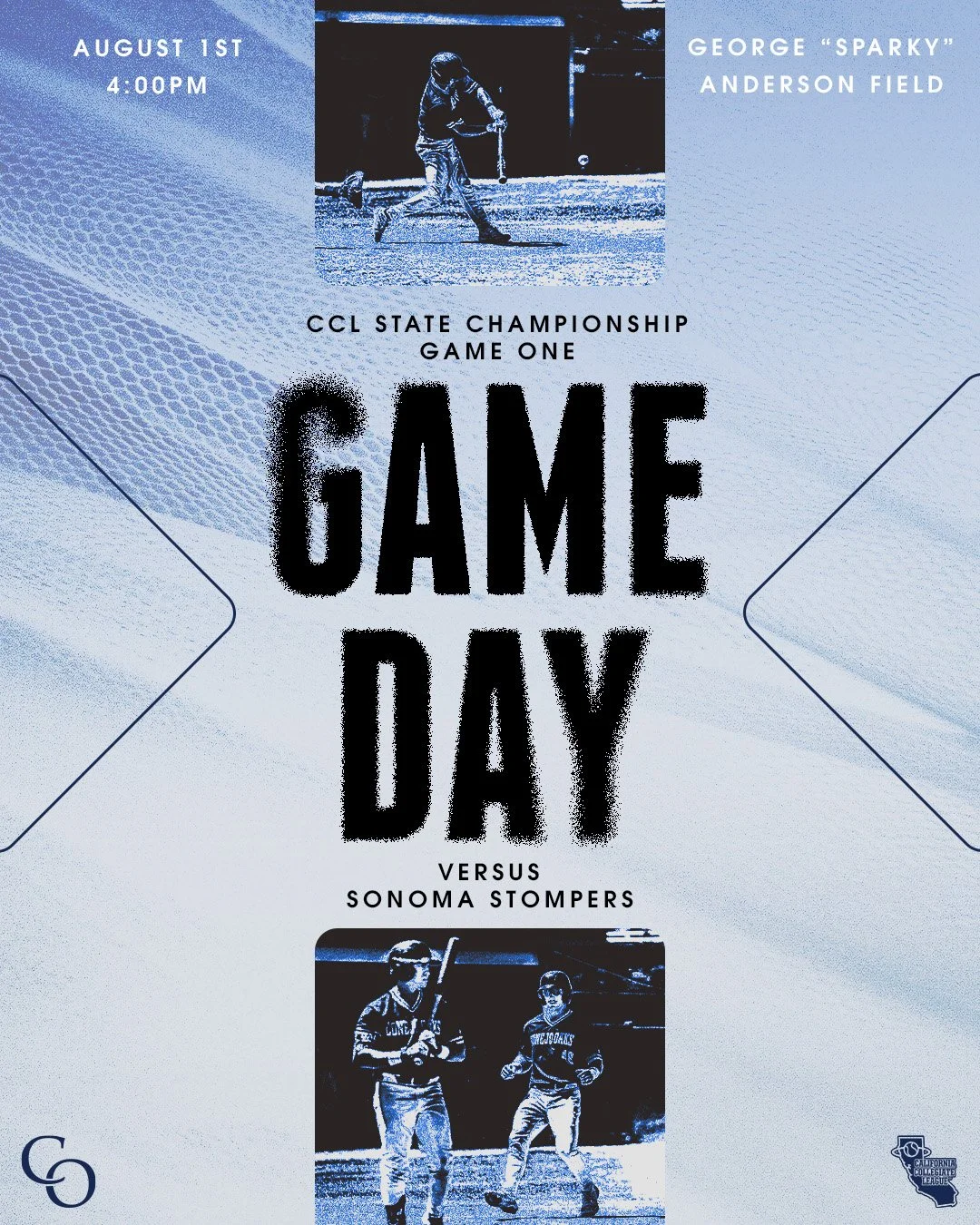
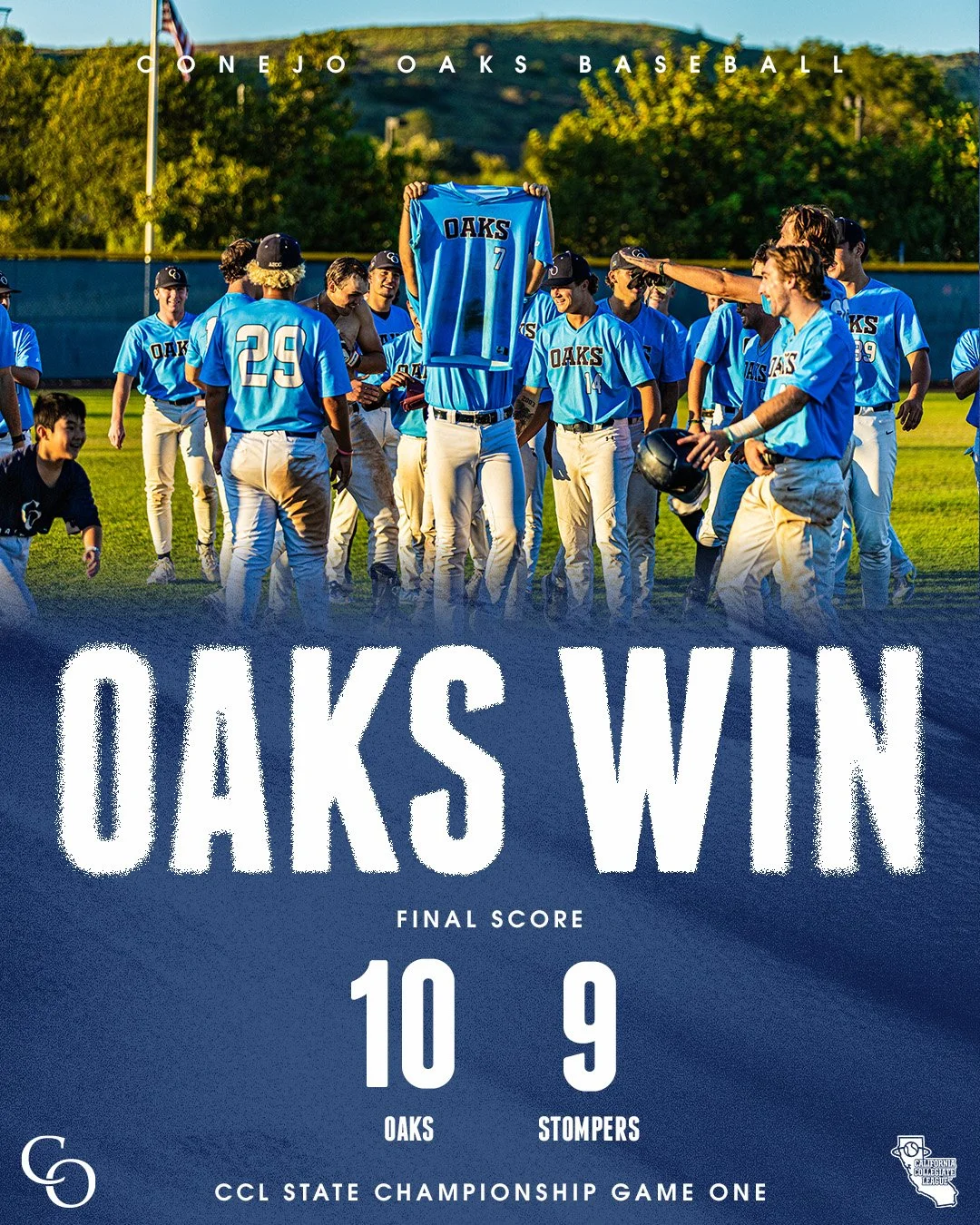
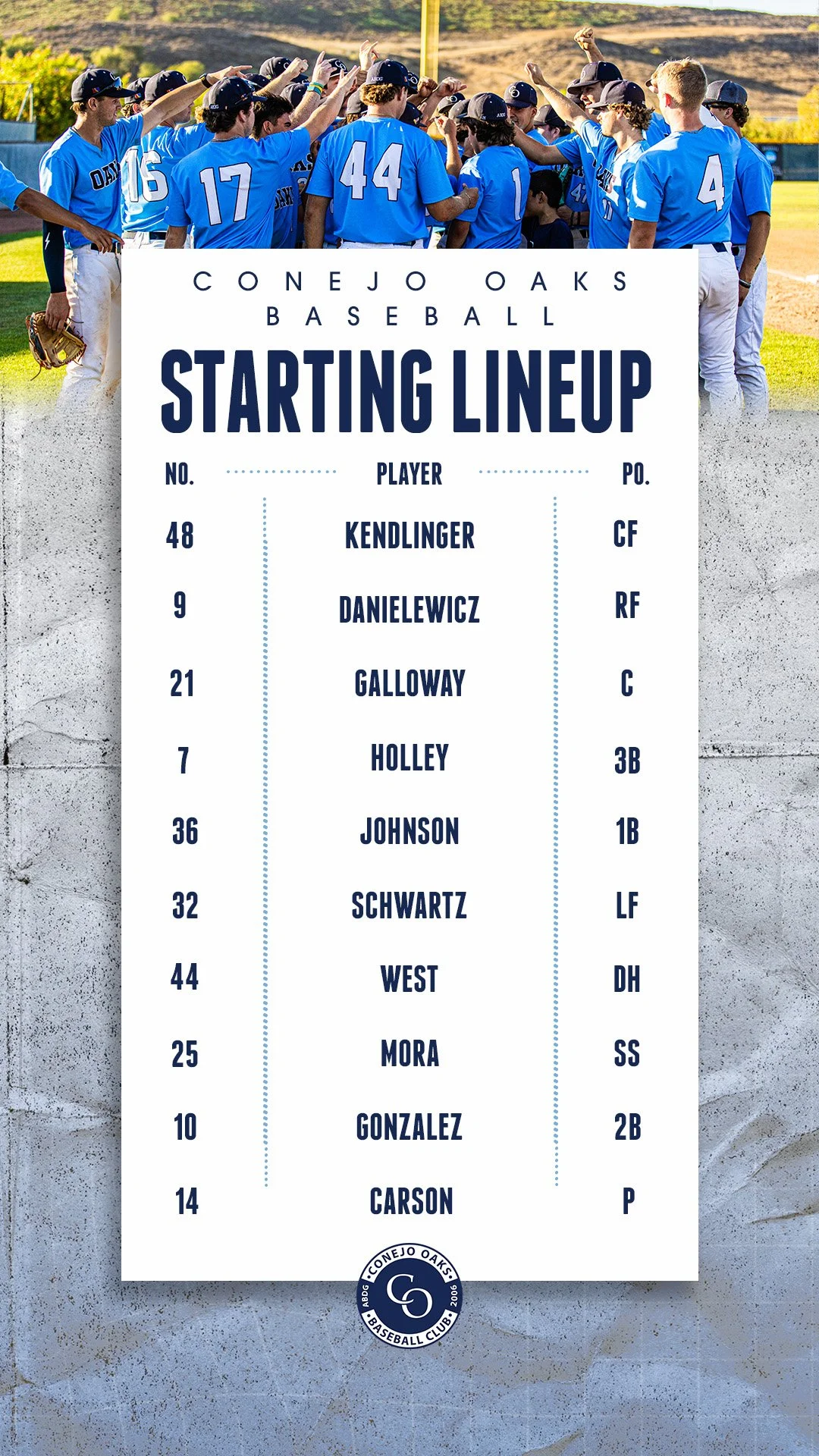
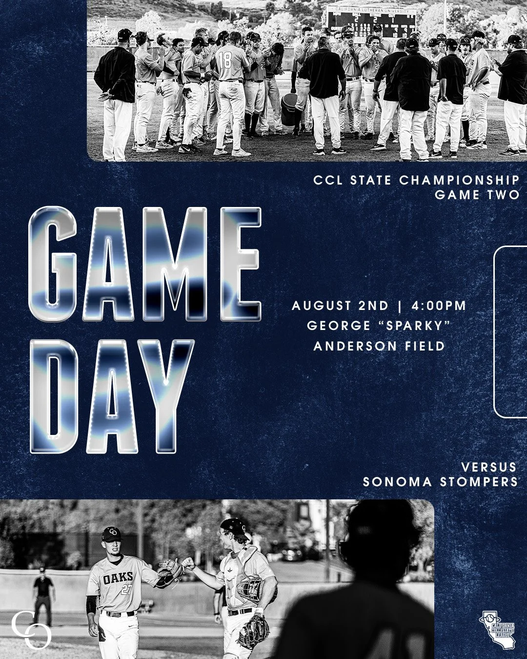
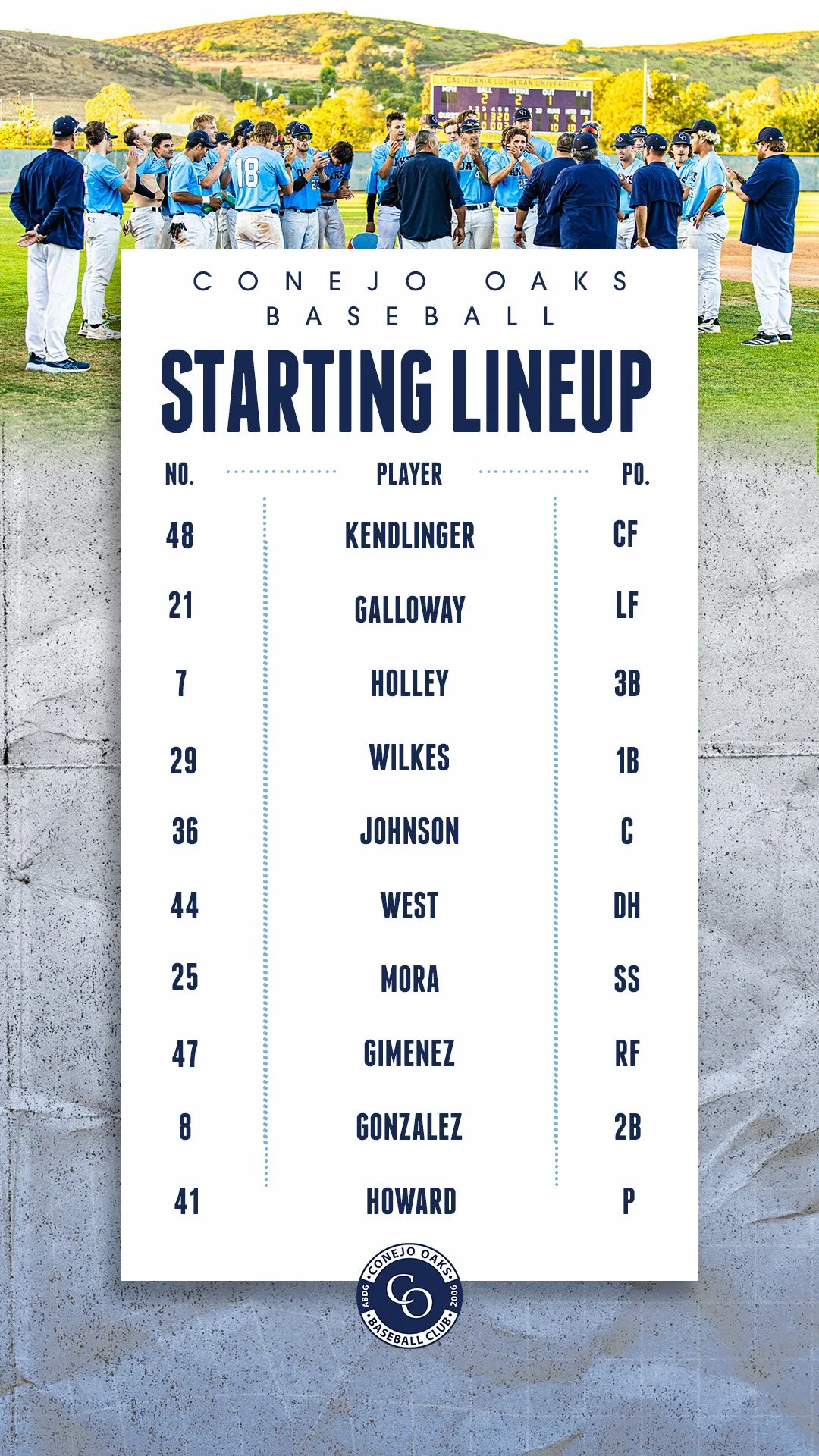
conejo oaks playoff design
For the Conejo Oaks playoff designs, I wanted to give the team a fresh look while still keeping their identity front and center. The goal was to create graphics that felt gritty and intimidating, something that carried the energy of postseason baseball and made the Oaks look like a team you don’t want to go up against. I pulled in familiar brand elements to keep the designs recognizable, but pushed the style to feel bolder, tougher, and playoff-ready.
Programs used:
Adobe Illustrator & Photoshop
Sketches
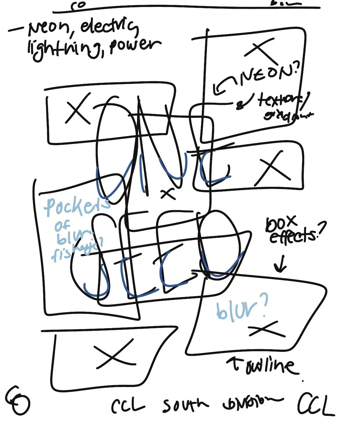
Rough drafts of my vision for the graphics. Graphics included informational, game day, final score, & bracket position graphics.

design elements


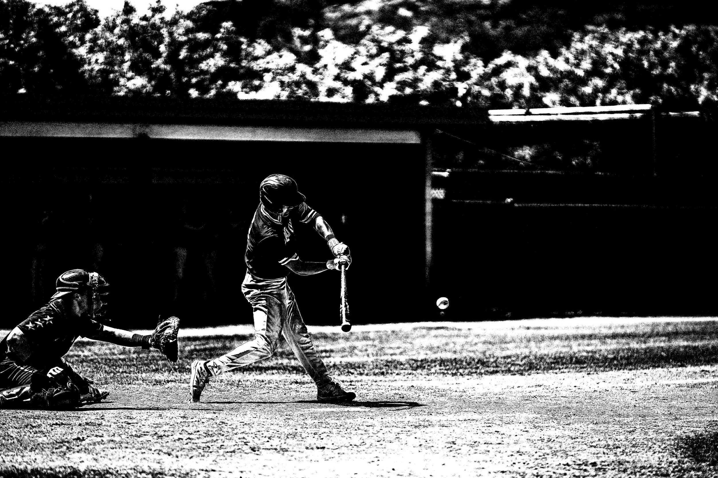
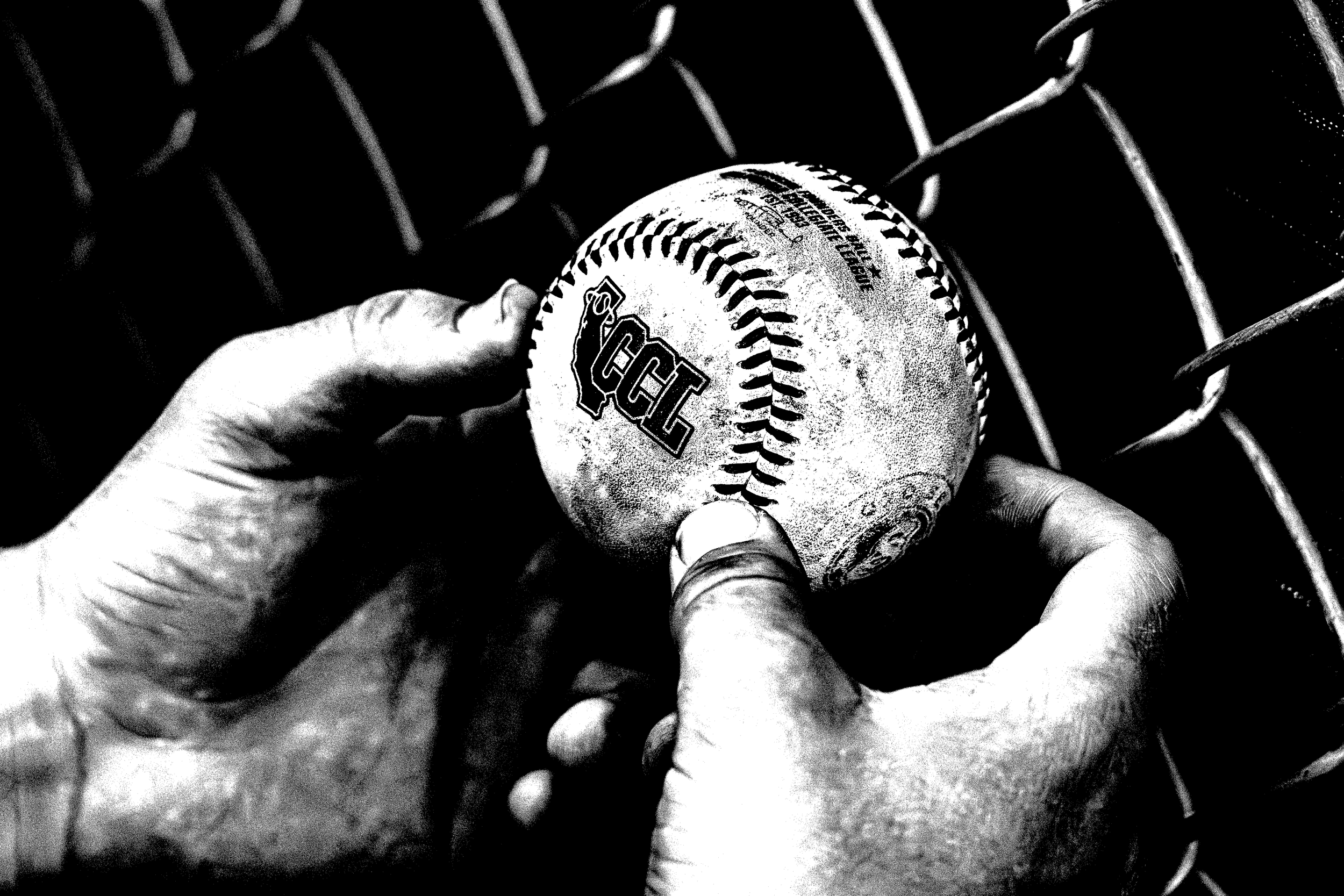
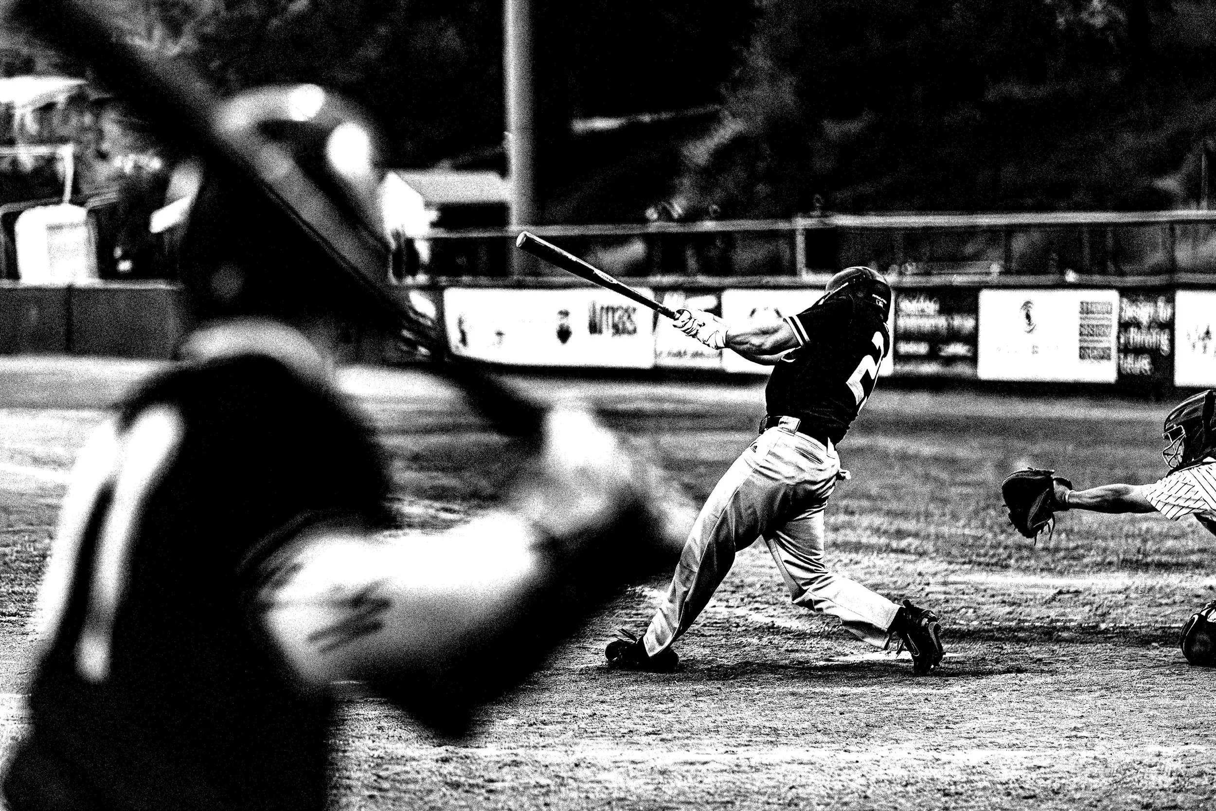
Textures & shapes I was pulling inspiration from
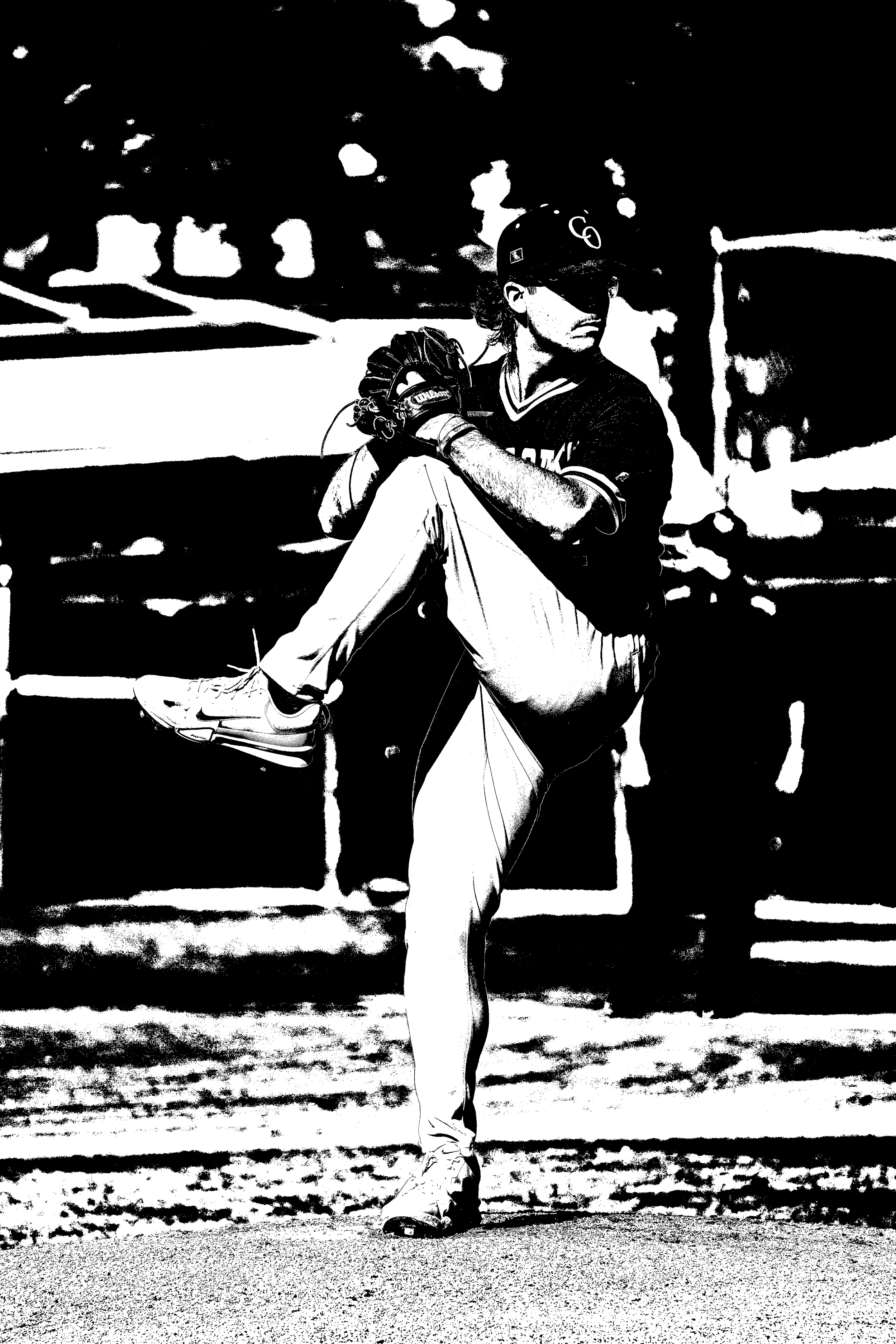
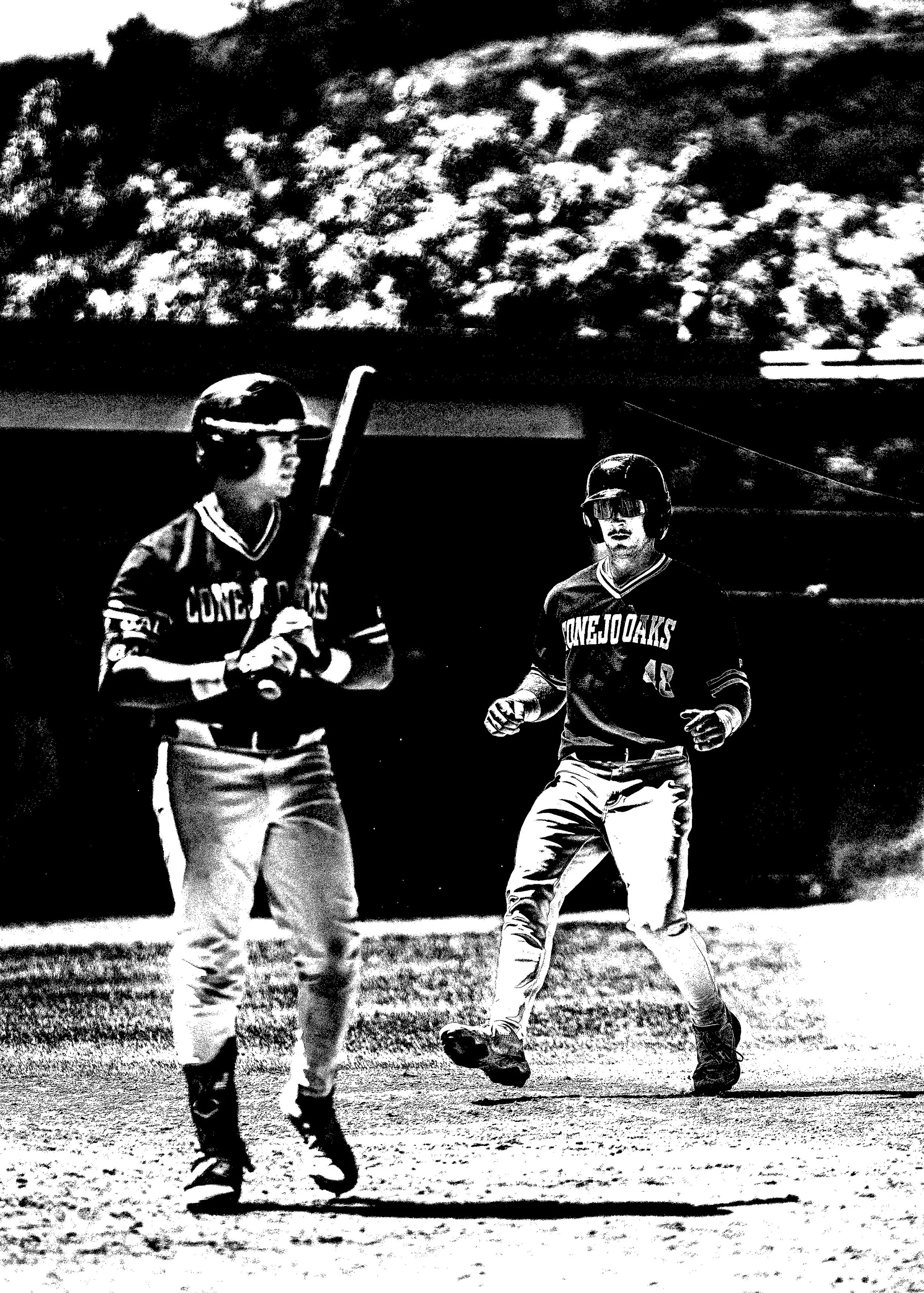
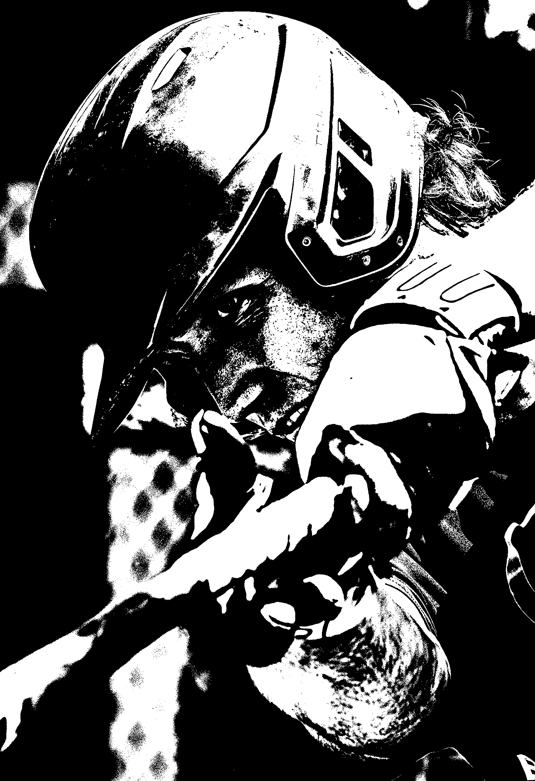
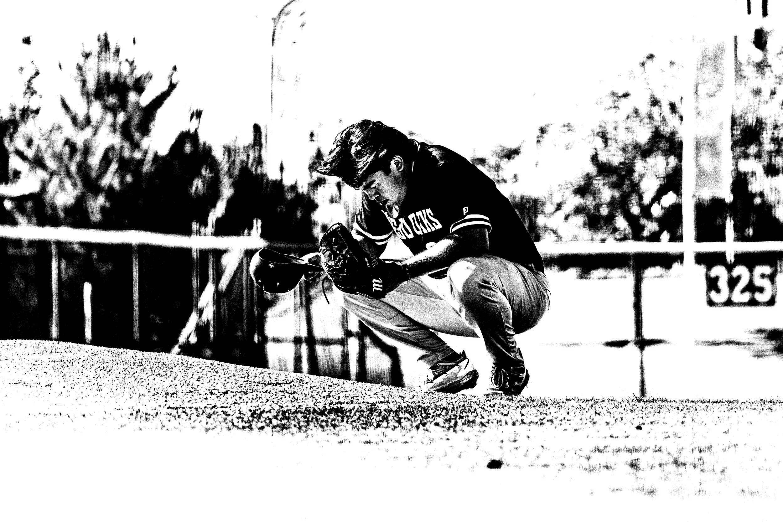
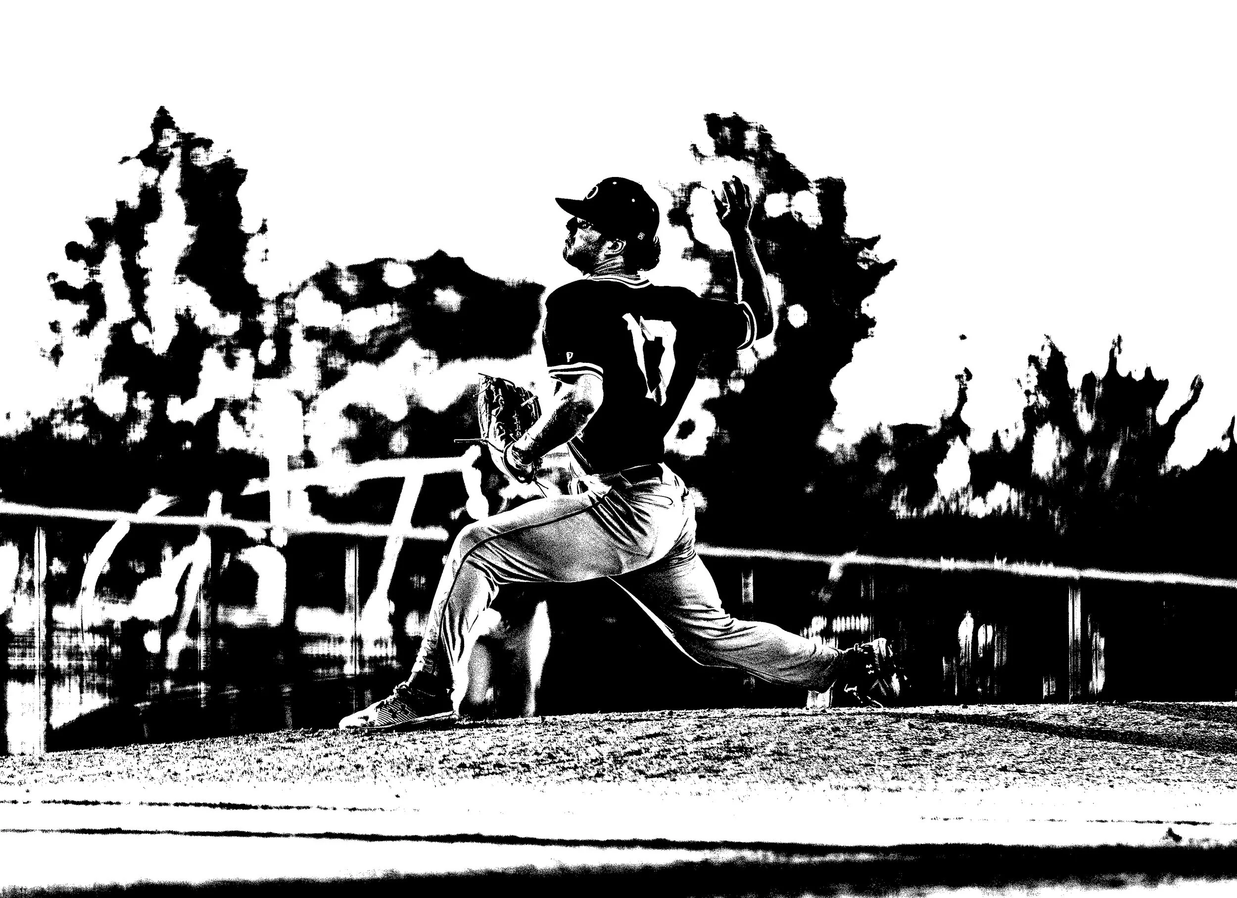
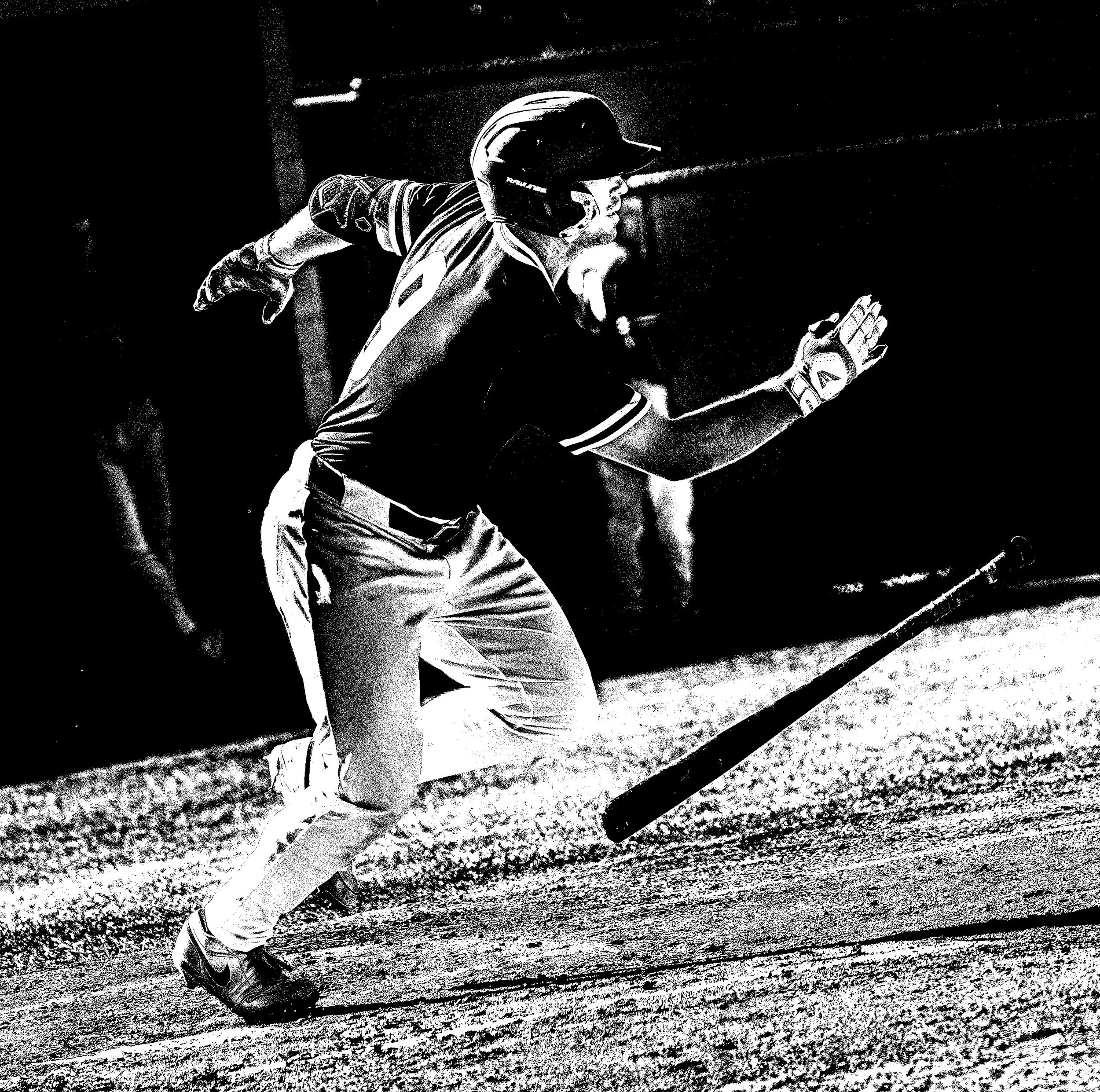
threshold edits
final designs